Kennedy does fashion. He needed a logo. We collaborated for a week. He now has a logo.
Friday:
Originally Ken didn't know what he wanted, nor did he have very much inspiration. After a short discussion, we both agreed that a modern logo concept and branding base were needed. It was decided that I would 'run wild' with it and see what happened next.
Tuesday:
After the weekend, and a day of work, we arrived at our first iteration set, and a style guide.
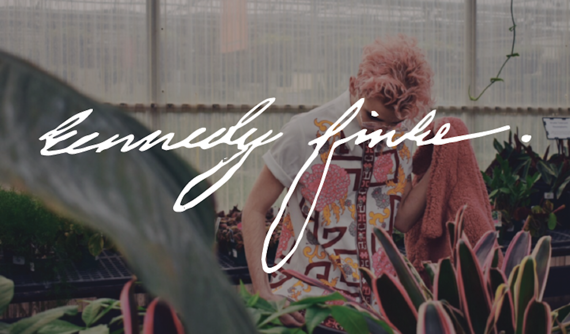
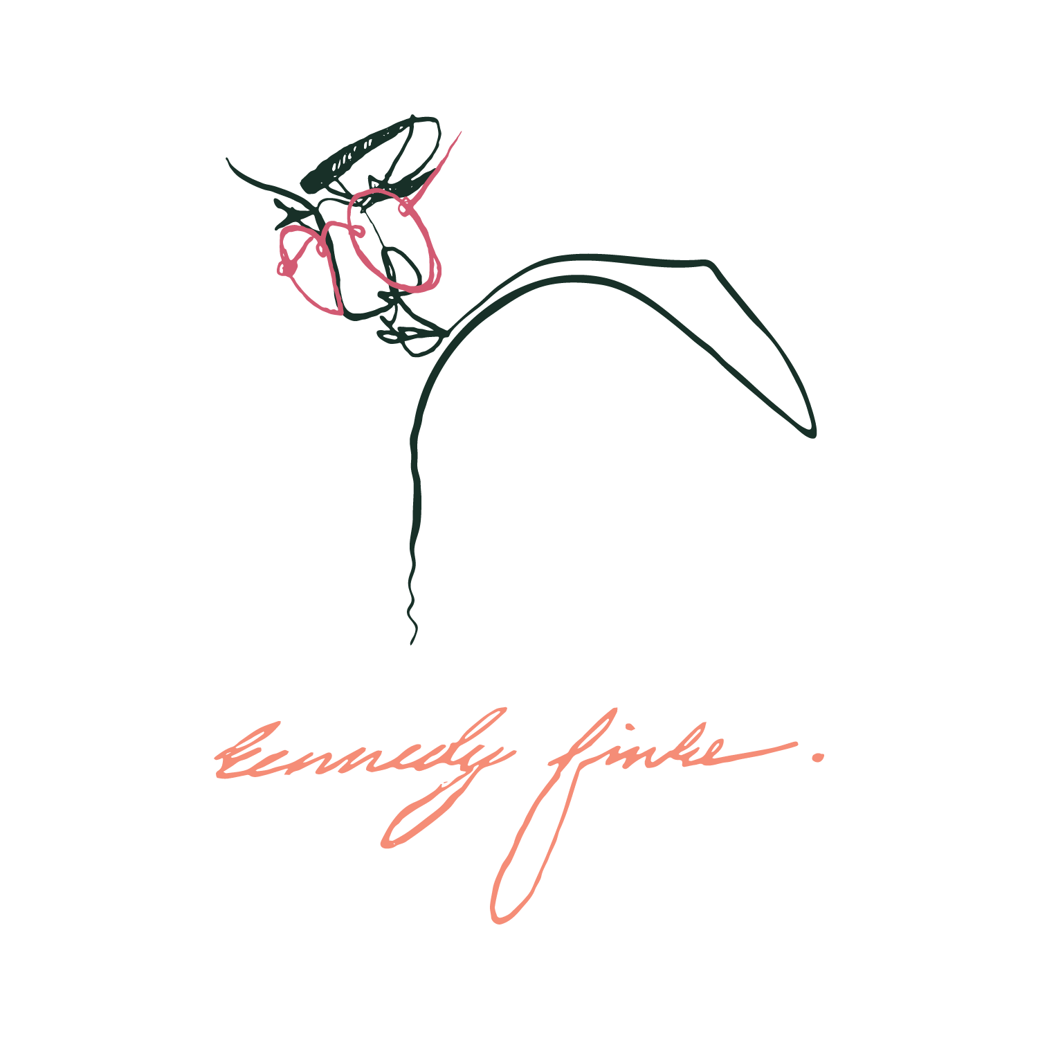
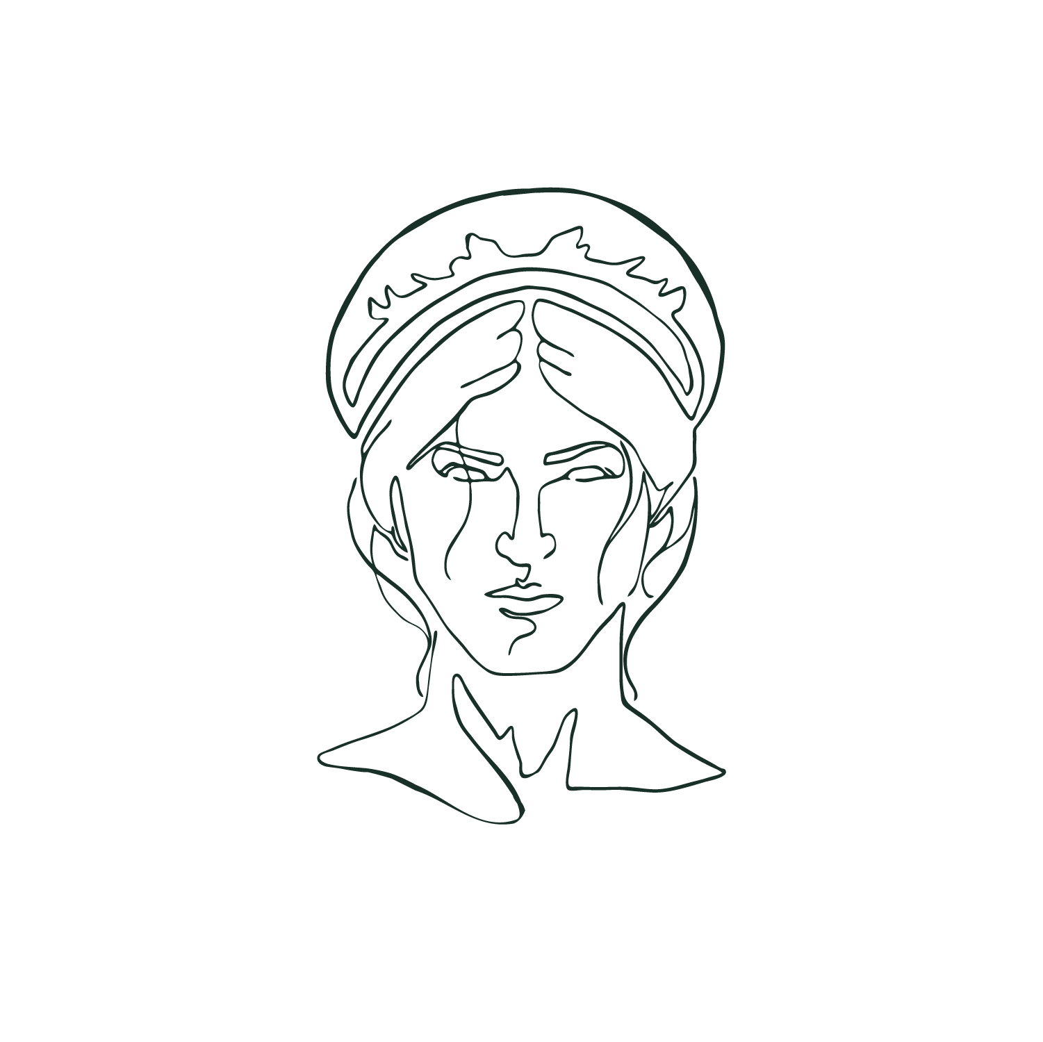
The logos themselves were driven by a mashup of Urban Outfitters® vibes with a sketchy accent and emphasis on line quality and style. The line 'portrait' of Ken was intended as the icon logo, but he said, "ew @ my face," being the logo.
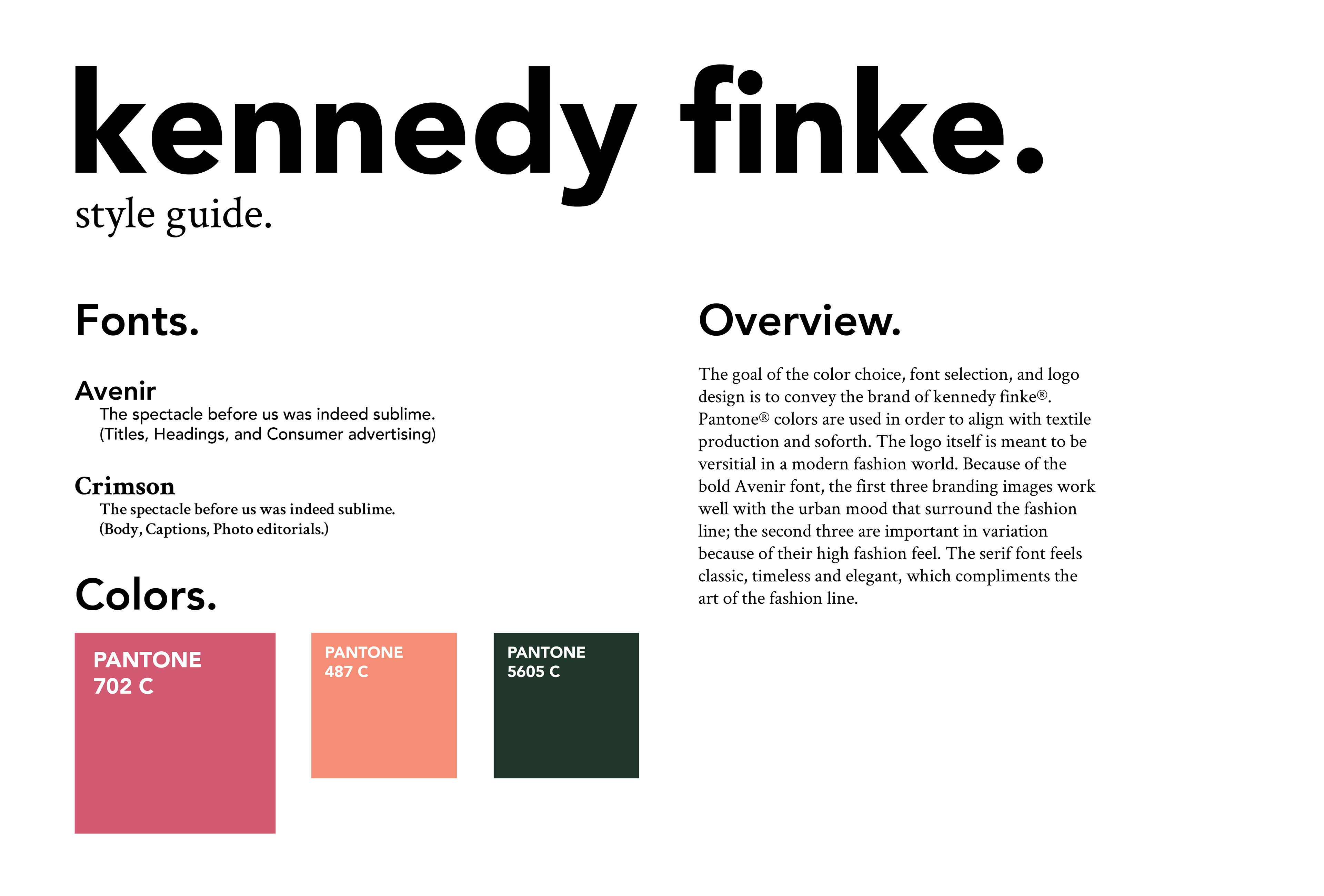
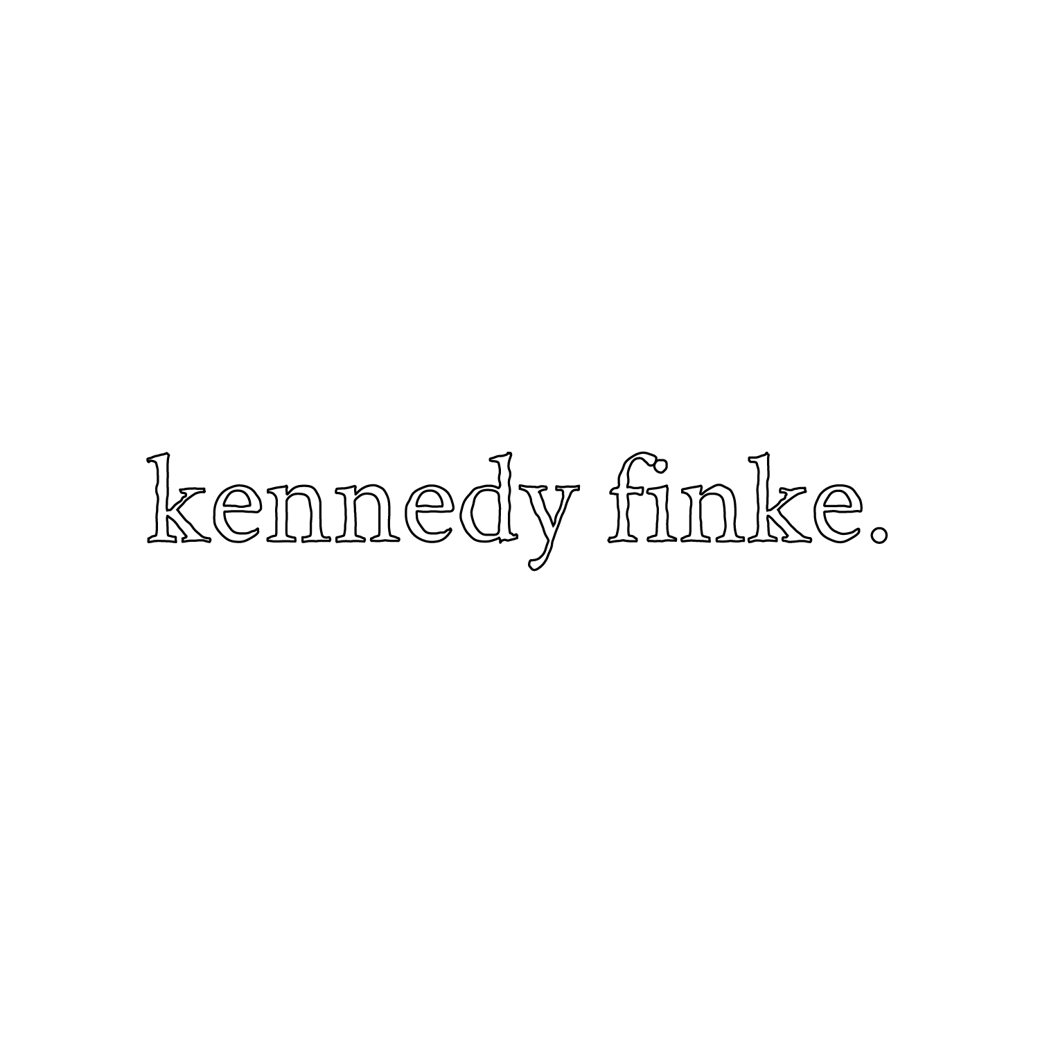
As well as the logos, font and color were chosen with a vintage kitschy vibe in mind, still following the modern feel Ken wanted.
Wednesday:
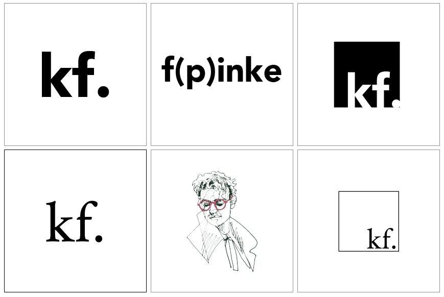
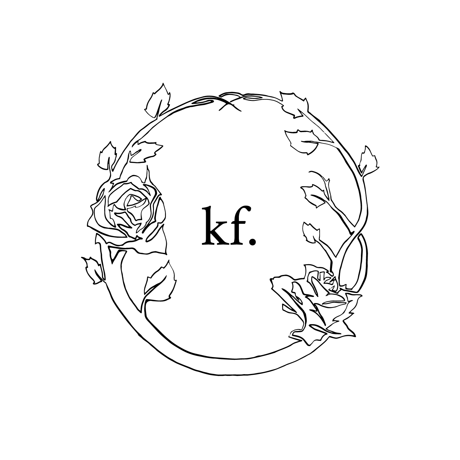
Ken got back to me and felt that another iteration on the icon was necessary. He loved the design brief, all but for the icon image. He wanted to draw new inspiration from Versace®'s medusa, encapsulating a "mysterious woman" in fashion.
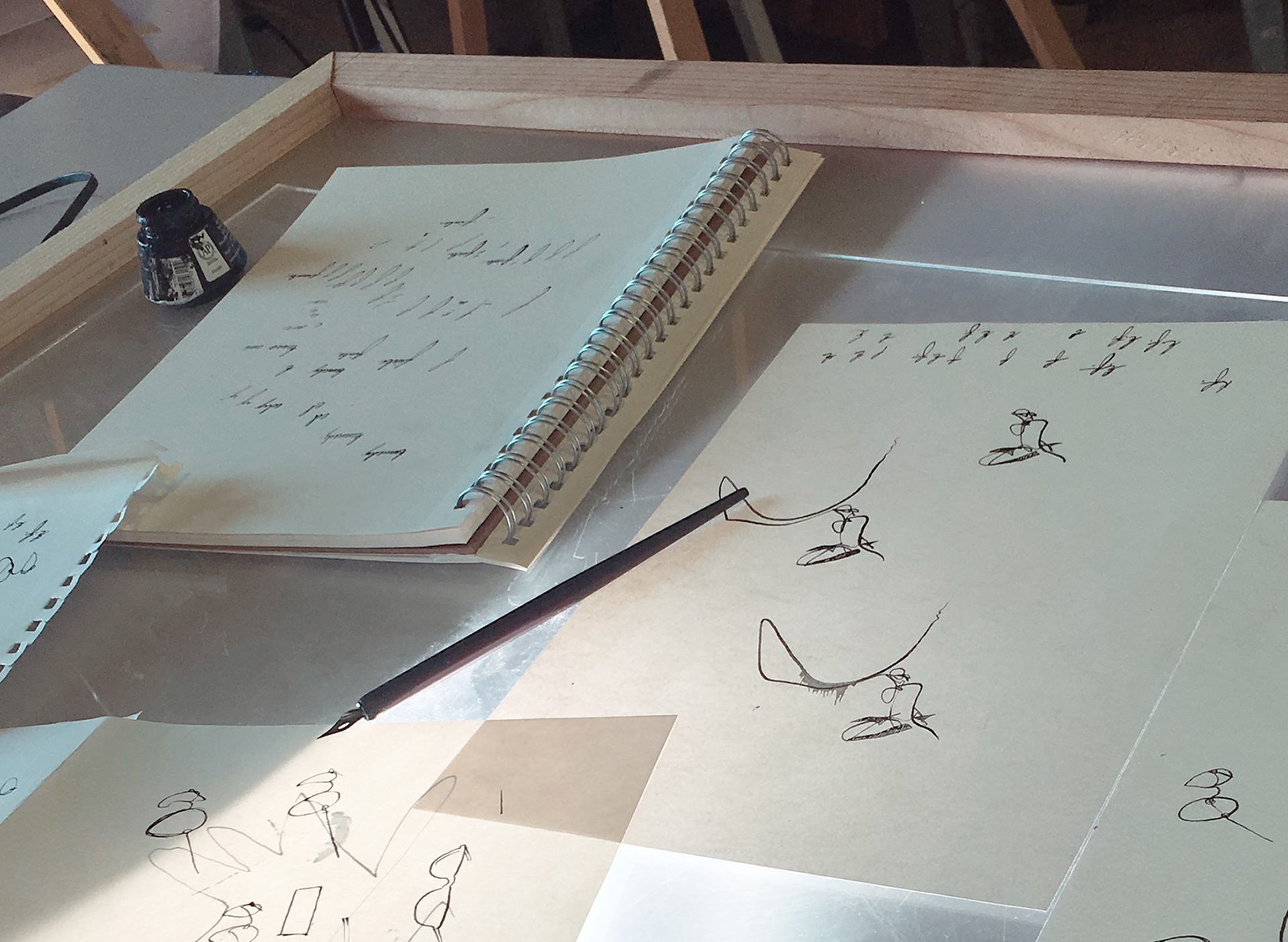
I went to the drawing board and decided that my subject would have to be partially hidden in some aspect. I chose to keep the glasses from the previous iteration, because out of context on the new female subject, they looked more enigmatic; it also drew connection to Kennedy's love for round glasses and gave a pop of color on her face.
Thursday:
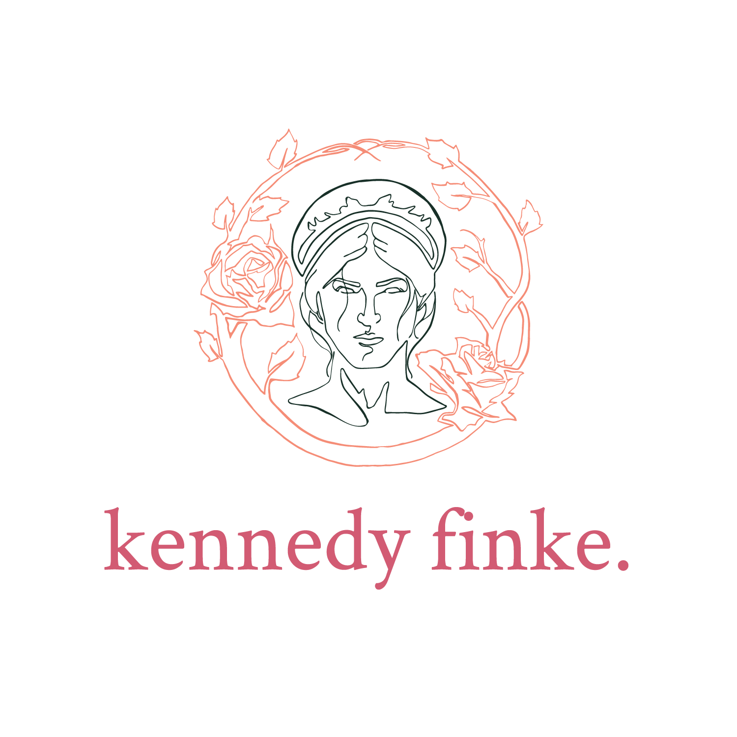
I gave Ken the new design on Thursday. After looking it over, he told me that the look was good, but he wanted a high fashion look; a legacy branding style in essence.
Friday:
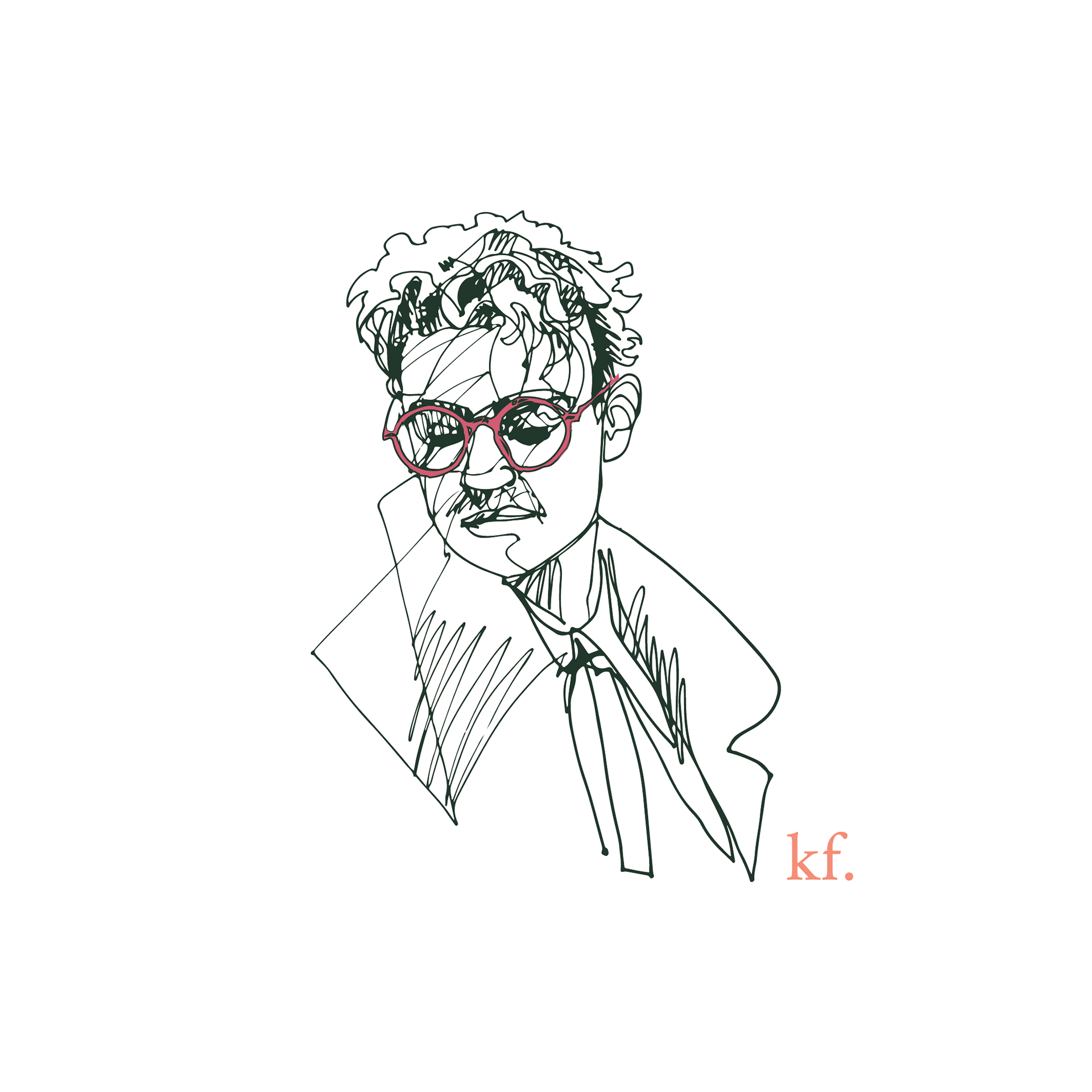
I gave Kennedy the newest iteration and he absolutely loved it. I was glad to be able to incorporate the line style into every design and give life to his fashion line again.
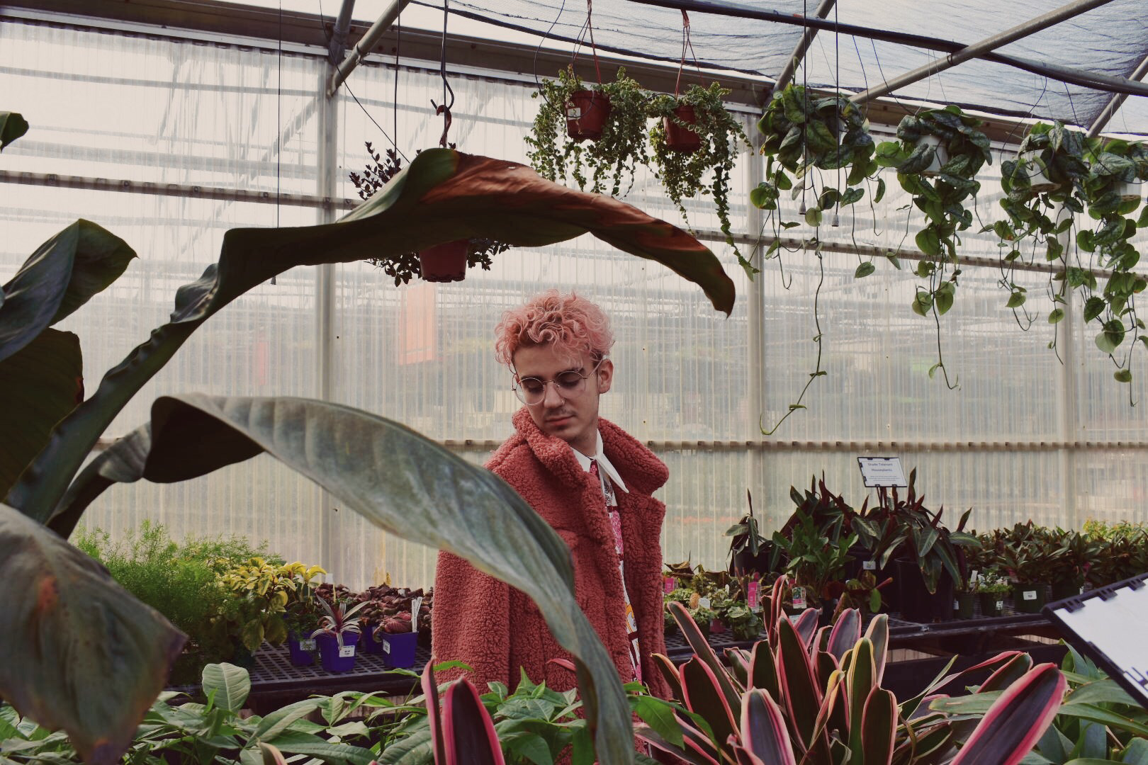
Courtesy of @ehoho on VSCO
Synopsis:
Ultimately I felt the second iteration was my finest work given the constraints but, you win some, you lose some.
