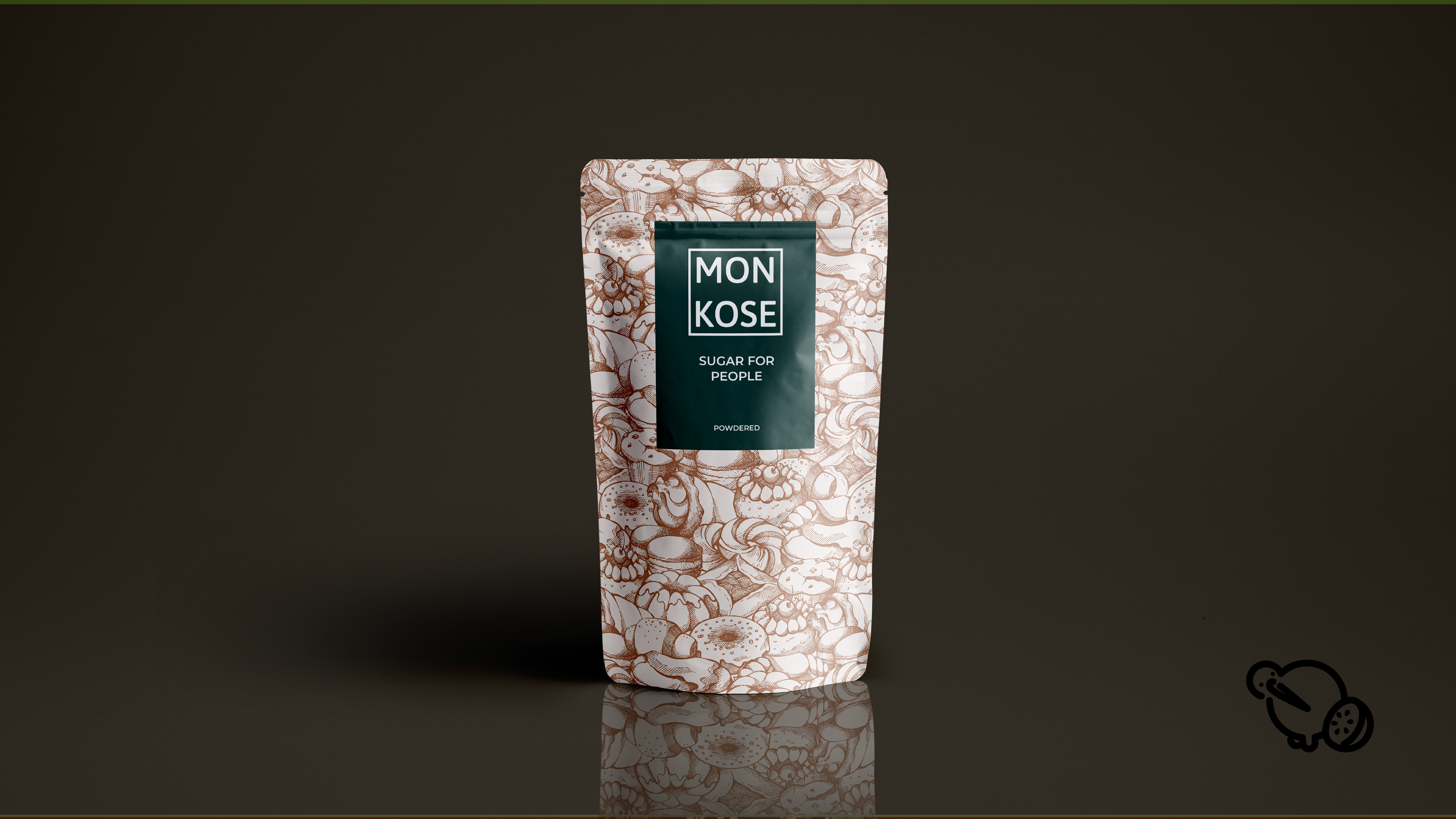
Sugar For People.
that simple
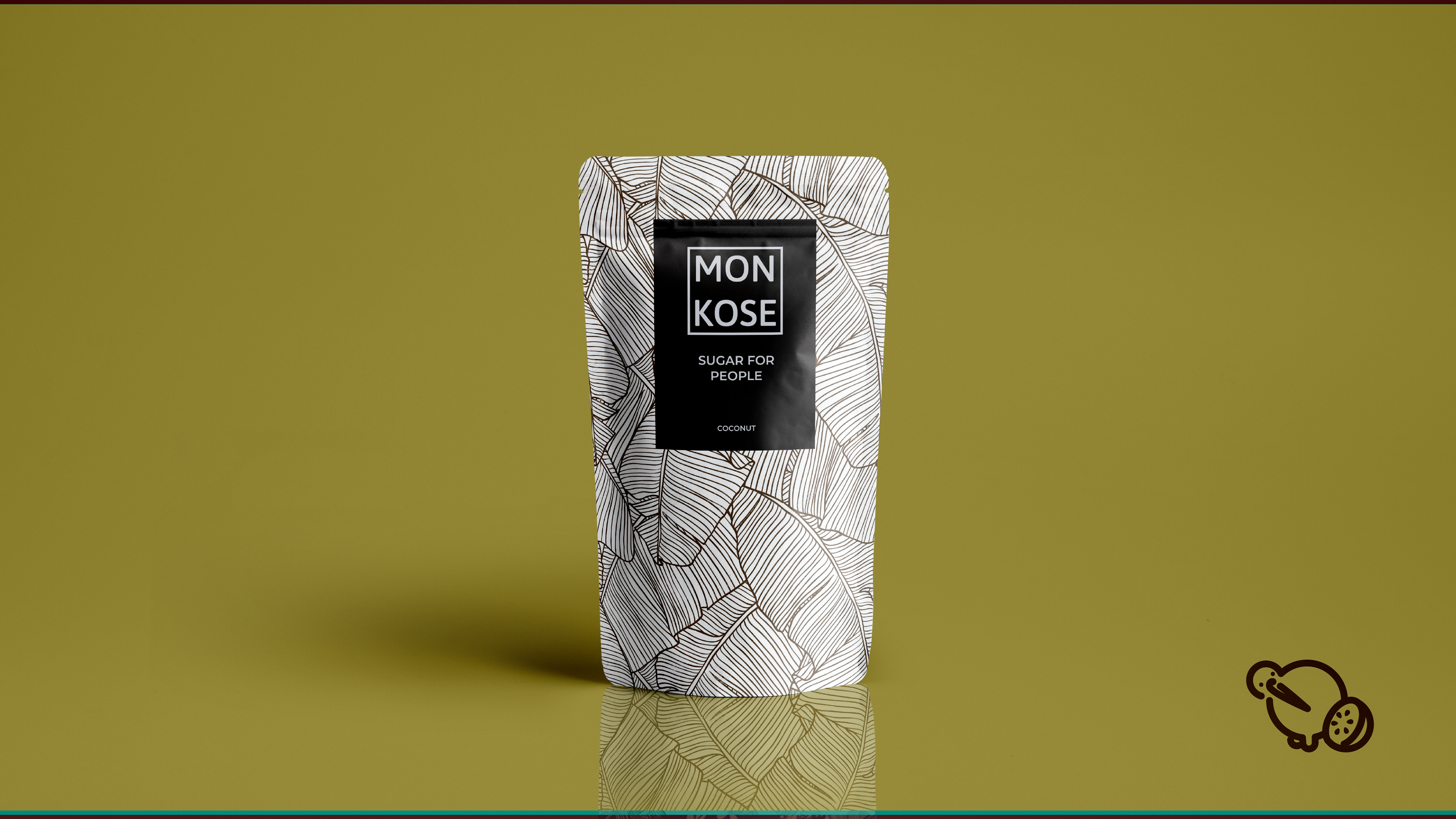
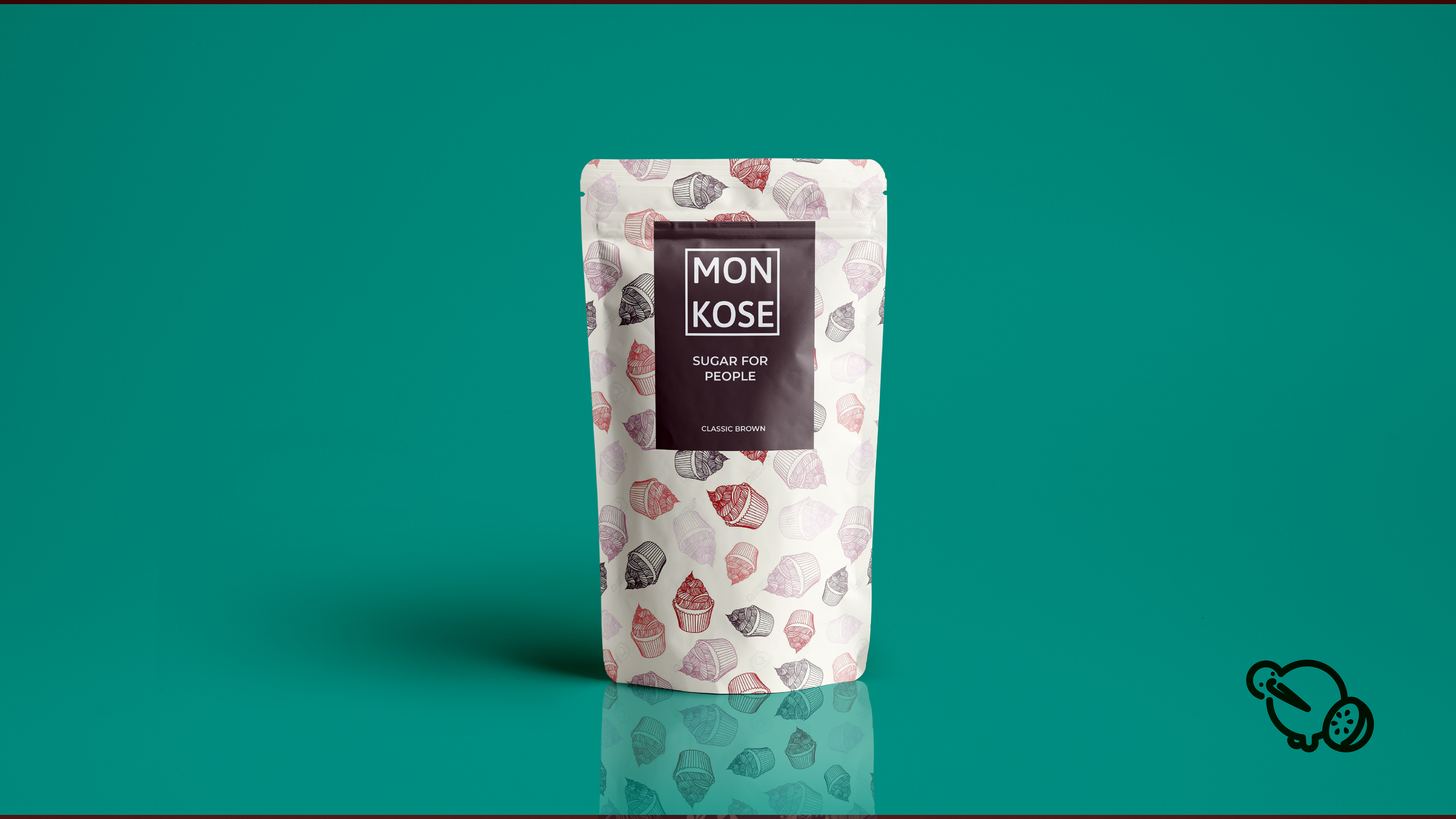
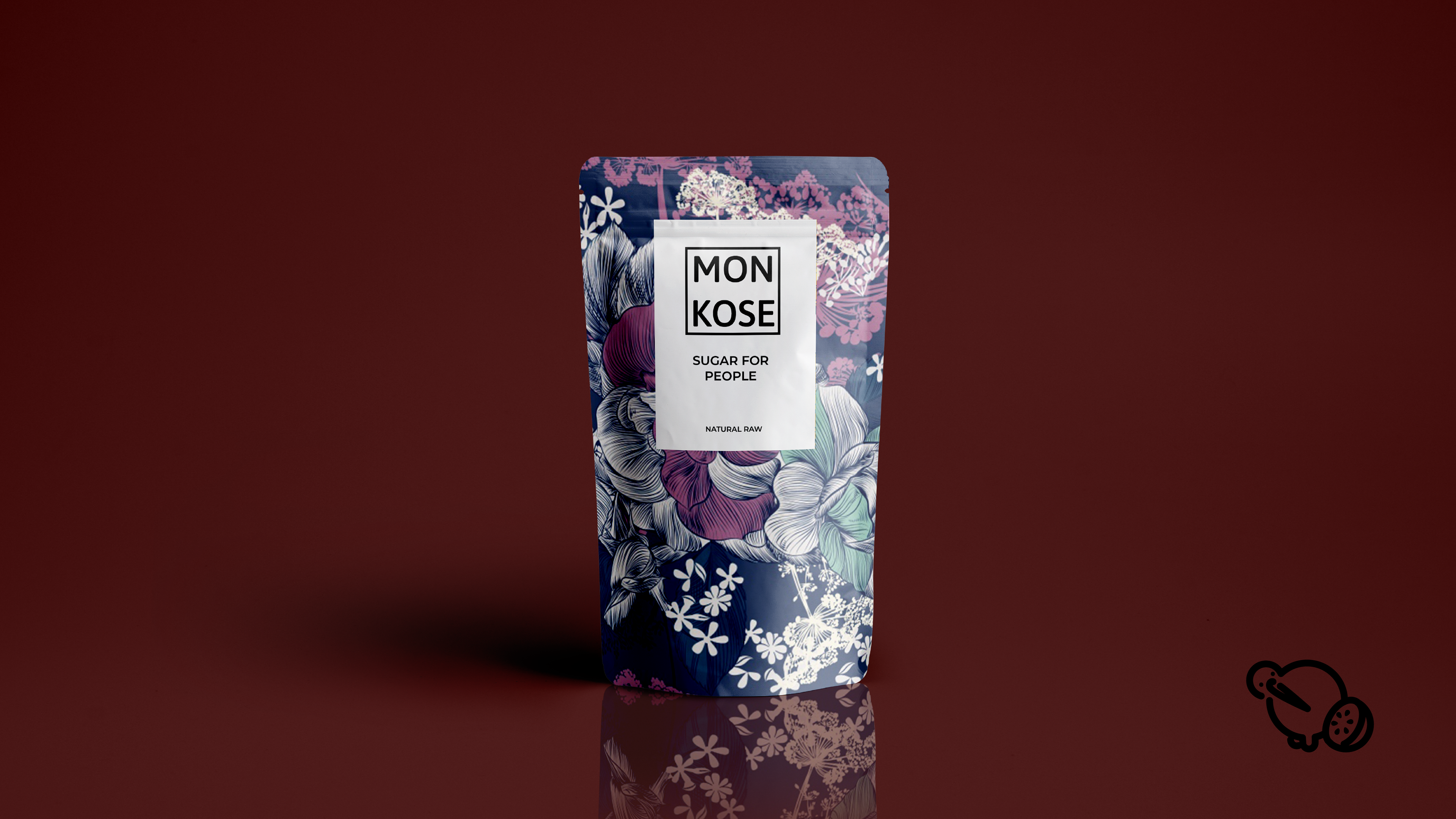
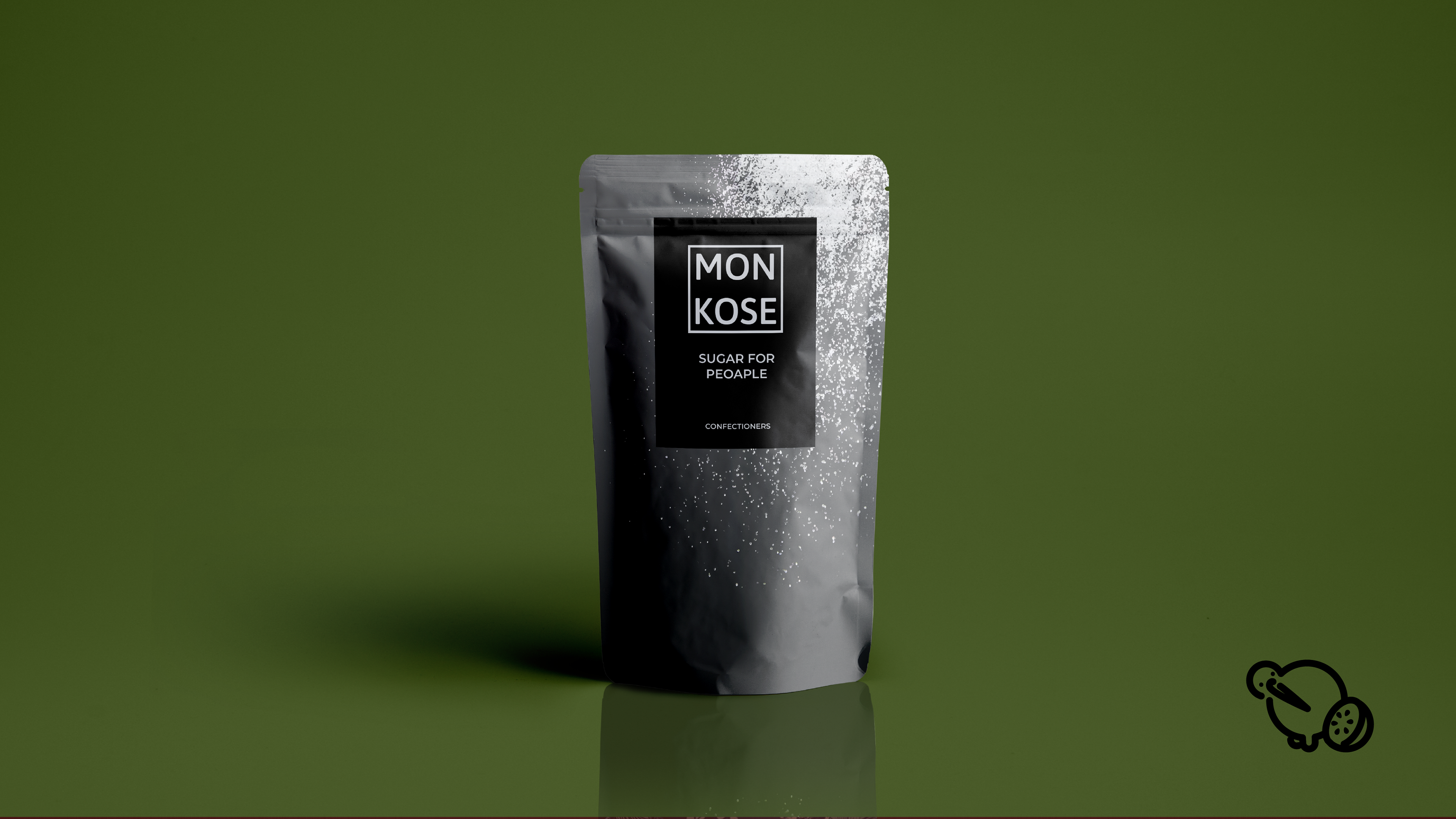
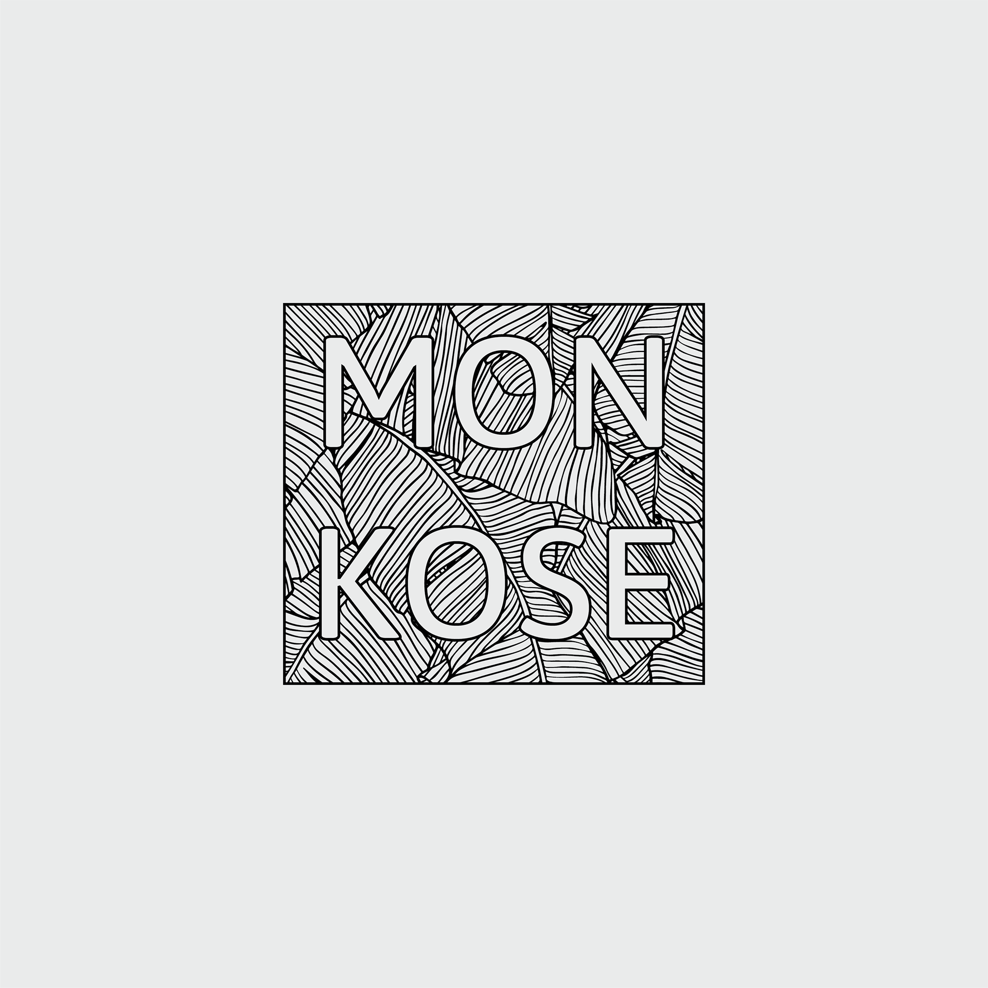
The goal for this project was to incorporate vibrant colors and patterns with the simplistic nature of Monkose's logo design. In essence, ground yourself from the clutter and noise of life–however colorful it may be–in the sweetness of the simple things. Whether that's coffee, or maybe a homemade desert, Monkose is designed to help you get back to your basics.

After doing a little research on what the sugar market offered, specifically artificial, I encountered a lack of versatility in flavor. There was more or less one "strain" of sugar provided by each company. I decided that the target niché was people looking for familiar tastes and textures, without the caloric weight.
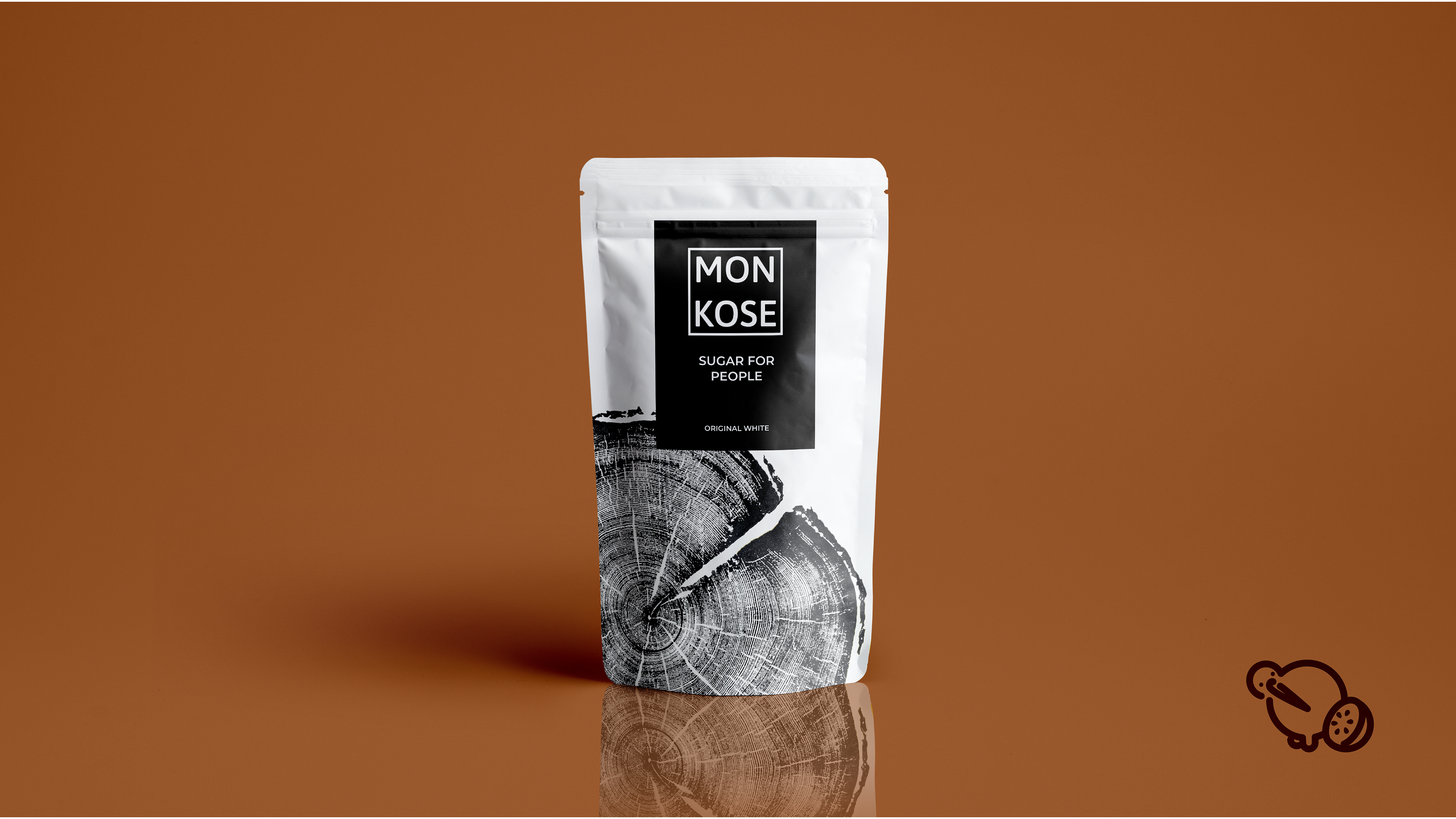
These rendered packages represent the most commercial sugar types. Each design reflects the sugar's speciality and use in everyday life.